ESSENCE OF COLOR
- Nitika Jain
- Aug 12, 2020
- 5 min read

Updated: Mar 26, 2021
My Color Directory
DAY 1 - 12/08/2020
This is my first project which is lead by Gauravi ma'am and Anshoo ma'am. In this, we were given one color each and were asked to collect 25 objects universally associated with that color. As you can see I got yellow.
So today we had to create swatches with those objects and it was MIND BLOWING. I got to know so much about colors and how different shades of one color make a huge difference in an object.


lemon was my first one and I loved the way it turned out.


The mustard sauce was one that made me struggle, I kept trying but that color was just not coming. then Anshoo ma'am told me that this is how you'll learn.


Maggi was the best for me


I eventually got better.


the oil swatches got rejected because I didn't choose the mustard oil and there are other oils that are not yellow 😥. But at least now I'll be more careful.
DAY 2 - 13/08/2020
Hey, welcome back, let's go again...


smiley ball reminded me of the song which can change my mood at any time.😍
you should listen to it too. 👉 Click here


Ok, so this 'pasta ka rasta' concept I personally like most.


This pineapple was really rotting but its smell was all around the room.


DAY 3 - 14/08/2020
Exploring Color Association


A DIVE INSIDE MY HEAD
I think you might like this one. this is something I was totally engaged in. this piece of work is basically a 'sneak peek' inside my head.
Let's dive right in but before that let me tell you about which part I'm taking you through. it is my association/bond with the color YELLOW. You might be able to relate to some of the points in this, so zoom into the pictures and enjoy.

Yes, that's right my mind is all messy yet full of colors.
To clarify your thoughts I want you to know that these are six different CONTEXTS in which I've distributed my associations with yellow color.


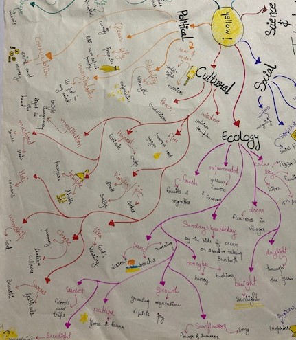

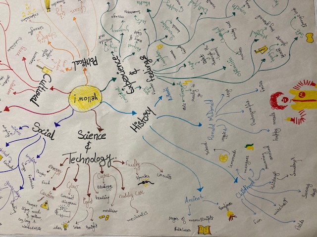

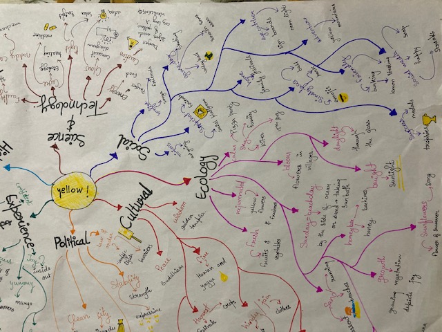
While doing this I was taken back in time where I was with my friends and family, on trips, and memories which were buried deep down in my head.
DAY 4 - 17/08/2020
COLORS: A Major Role Play
It's day 4 of my project and my task for today was to watch a movie! I know right this is hilarious, but there's a catch, we had to choose a movie where the given color was depicted in various aspects. So I chose THE LION KING.

Here are my 5 screenshots reflecting different meanings in yellow color.

The first image is of the rising sun depicting the growth and start of something new as it is bright and calm.

The second image MUFASA the king who seems confident as the sun rays fall on his boldface.

In the third image, you can see SIMBA under the bright sunshine reflecting joy and happiness in a newborn cub.

The fourth one is of SIMBA who is furious, as the flames grow taller, his anger is also increasing.

The last picture is of MUFASA falling from the cliff all pale and vulnerable.
REFLECTION 1

Color is medium to express feelings. These feelings change when various aspects of the color change. What are the various aspects of color? The three main aspects of color are HUE, SATURATION & BRIGHTNESS. I have studied the YELLOW color till now, and I have realized that a slight change can lead to a major difference in the feeling one gets from the color.

HUE is the name of the color, as we call it. Or it can be the range of colors. Red, Yellow, Green, and Blue are a few examples of hue. Red may depict love, Yellow joy, Green can be mysterious, and Blue can be calming. These feelings may differ when we add the other aspects of color to the hue. This is because these aspects change the appearance of the color.

When we talk about the SATURATION of color, we think of how dark or light the color is. Saturation is the intensity of the color. The same red color, when has a higher intensity, may represent danger. Low-intensity yellow can give one a feeling of dullness. Slightly changing the intensity of the green color can make it disgusting. Dark blue represents sadness which means, the low intensity of the same color might give a different feeling. Intensity works this way as the retina has sensitive cones that are color receptors.

BRIGHTNESS is another aspect that tells us how light or dark the color is. In other words how much white or black part does it have. Rods are the receptors in the retina that detects brightness.
These aspects are the reason we get different feelings from looking at something.
DAY 5 - 18/08/2020
COLOUR ON DIFFERENT MATERIALS
It was a long day yet enjoyable on its own. We were asked to collect surfaces of different materials for this task. I was running around my house in search of the surfaces and I was lucky enough to find 6 of them. We had to observe different behavior of color under varied conditions and surfaces. I started applying YELLOW to all those surfaces and got incredible results.


There is something else that I did today.
I sent some of you a form to fill which was regarding how you perceive the color. Many of you responded to that for which I'm thankful.
Here are the results of that survey.


As you can see for the second question 58.5% of the people have responded that they associate LOYALTY with "blue" color whereas I come under 22.6%.
For the third question majority of people think of yellow as a positive color. The most common responses are happy, joy, and bright.
In the fourth question, I attached a picture or a room and wanted to know how the color of that space affects people, in this case, the majority of them found it SOOTHING and many thought it is dull. But the interesting part is that 18% of them felt 'just right' by only seeing the image.
SO TO CONCLUDE
Yellow color brings happiness as well as dullness in people's life. It is just the TONE of it that makes it positive or negative.
REFLECTION
DAY 6 - 19/08/2020
It’s the final day of my first project and only in 6 days, my perspective has taken a huge leap. It all started on the first day itself where I came to know that different objects don't have the same hue of yellow and this variation in hues is the reason we like or dislike them.


Firstly, collecting objects UNIVERSALLY ASSOCIATED with yellow seemed to me like a dead end because I couldn't think of 25 objects. Yet at the end of the day, I had a list of 45 items. When I started to create swatches, it blew off my mind because not a single object had the same tone. Mustard sauce made me struggle a lot which was my lesson to keep trying as stated by Anshoo ma'am and this motivated me. The next day our task was leveled with the inquiry part. It took my work to a whole new personal level. I wrote down my memories, immediate thoughts, and feelings in my journal. This allowed me to express and explore myself. We were also given a piece to read which was about color psychology. I learned about japan's suicidal conditions and how blue is used to calm them down. Digging deep over the internet into why I associate yellow with the things I wrote earlier in the journal, I created a mindmap where I questioned at every point that WHY is it so and how was I able to categorize them in various contexts, I even flipped through some encyclopedias and realized that there is a reason behind everything. After that, we were shown a video where color played an important role in branding and film making and how the emotions are shown by changing background lights, this was something I had never noticed before that day. The task was to show different emotions in a movie due to variations in hues. I took screenshots of scenes in THE LION KING which portrayed distinctive emotions.
I'm sure that these observations are going to help me in my future projects as now I know how color can affect one's mind.
FEEDBACK


Comments