ILLUSTRATED VECTOR MAP
- Nitika Jain
- Sep 15, 2020
- 3 min read

Updated: Nov 27, 2020
PRE-WORK - 13 September 2020
My first project of the most exciting class is here, it is lead by Lovelish Sir and Prachi Ma'am. Working with Illustrator is amazing now, I'm able to catch up with everything that sir tells but now it's time for the application part.


The pre-task for this project was to make a hand-drawn map of an area that I'm familiar with. So I chose a spot close to my house and drew a map from my memory.
I tried a few times before putting up the final map which will look even better when recreated on Ai.
STAGE 1- 17 September 2020
MAKE A PLAN
I started by making the blocks with the help of the grid.

But then Lovelish sir told us a different and easy method. He introduces us to a new tool "expand". He used the line tool to trace the road and then with the expand tool converted those lines into rectangles.
Object > Expand
After seeing that I made a road with lines and expanded them but the size of the rectangles was not changing as he showed us. So I went back to my blocks thing and completed my line drawing map.


We went in groups to meet Prachi ma'am in a separate meeting where she asked us to visualize the outcome of the final map. I want my map to be:
funky
comical
not google-like
should describe me
Then we discussed a few tips on how we can achieve the results we desire.
Varying densities
Color tones
Icons
ICONS
These are the icons that I've made with as many details as possible. By getting into details I've practiced everything taught till now. I think I'm going to make more of these icons because these don't look sufficient for the whole map.


STAGE 2 - 28 September 2020
COLOUR AND COMPOSE
This was my first attempt to achieve the desired results. I don't like it as it is but with a few changes it might come out pretty well.


Here are a few more attempts:


This was how my workspace looked like. Artboard was nowhere to be found 😅.
I also tried clipping masks and symbols combined but it was too much.

Finally matching to my keyword "funky" I found a combination.


I think that there's a lot happening in a single frame but that "describes me". These uneven edges are definitely "not google-like". It'll become "comical" in the end.
After getting the feedback from Prachi ma'am, I made my icons black and white.

But after looking at this final result, the icons seemed off. Then I realized that the circles should be of different colors.

For the finishing touches, I added text to the map.


This is how my final map looks like. I'm super happy with the outcome. All my keywords fit in perfectly here. The "comical" part that was missing earlier is visible through the text.
STAGE 3 - 13 October 2020
ABSTRACTION


I struggled a lot with abstraction. Adding the scribble effect was interesting. First, I applied the scribble effect on the blocks and then on the roads, and then on both. But, after talking to Pachi ma'am she said that I must go with the symbol and masking that I had tried earlier.
I created the striped dot symbol and applied that on the map. Then, I masked the blocks and symbols which gave this abstract.

I tried to show EMPHASIS through this abstraction. And since I was running short of time, I submitted this.

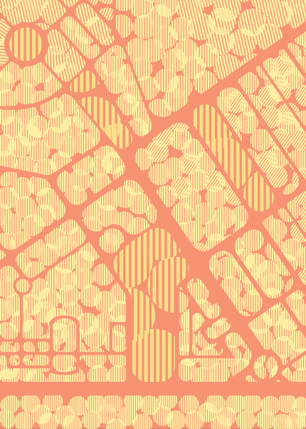


This is the final abstraction where I have tried to depict EMPHASIS, MOVEMENT, BALANCE & HARMONY.
FEEDBACK - 6 November 2020

THANK YOU


Comments